How to Select Paint Colors that Enhance Yoga Daze

Color plays a vital role in shaping your yoga environment. The right hues can create a serene and energizing space, enhancing your practice. For instance, calming blues and greens promote tranquility, while warm tones can uplift your spirit. When you choose the perfect yoga daze paint color, you set the stage for a more focused and enjoyable experience. Embrace the power of color to transform your yoga practice into a truly immersive journey.
Key Takeaways
Choose colors that resonate with your personal preferences to create an inviting yoga atmosphere.
Consider the type of yoga you practice; calming hues suit restorative styles, while vibrant colors energize dynamic practices.
Test paint samples in your space to see how they interact with natural and artificial lighting throughout the day.
Understand the impact of color undertones; warm tones energize, while cool tones promote calmness and focus.
Select colors with an appropriate Light Reflectance Value (LRV) to maintain a bright and inviting environment.
Use nature as inspiration for your color choices, reflecting the calming and energizing effects of the natural world.
Trust your instincts when selecting colors; if a hue makes you feel good, it’s likely the right choice for your yoga space.
Determine the Desired Mood for Yoga Practice
Identify Personal Preferences
When you start selecting colors for your yoga space, think about what resonates with you. Your personal preferences play a huge role in creating an inviting atmosphere. Do you feel calm surrounded by soft blues and greens? Or do you prefer the warmth of yellows and oranges?
Consider how different colors make you feel. For instance, calming hues can help you focus during meditation. On the other hand, vibrant shades might energize your practice. Reflect on your experiences with colors. Your cultural background and personal history can shape your connection to specific hues.
Consider the Type of Yoga Practiced
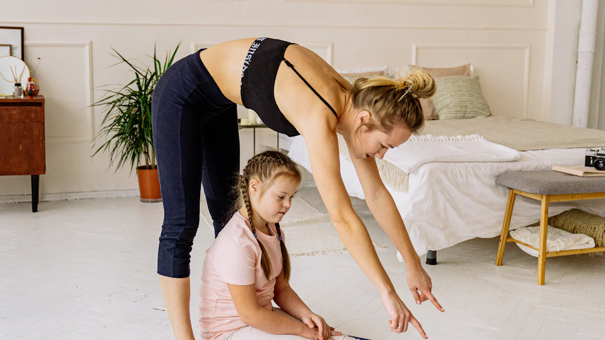
The type of yoga you practice also influences your color choices. Different styles evoke different energies. If you enjoy restorative yoga, opt for soothing colors that promote relaxation. Soft pastels or earthy tones can create a peaceful environment.
For more dynamic practices like vinyasa or power yoga, consider brighter colors. These can inspire energy and movement. Colors like vibrant oranges or lively yellows can enhance your experience.
Incorporating these elements into your decision-making process will help you find the perfect yoga daze paint color. Remember, the goal is to create a space that feels right for you and supports your practice.
Explore Popular Color Choices that Align with Yoga Themes
Calming Blues and Greens
You can create a peaceful atmosphere by choosing calming blues and greens for your yoga space. These colors promote tranquility and focus, making them perfect for meditation and restorative practices. Soft pastel shades like light blue and pale pink are known for their soothing properties. They help you feel at ease, allowing your mind to settle during your practice. Shades of green also play a vital role. They promote harmony and equilibrium, helping you feel grounded and connected to nature. Consider using these colors on your walls or as accents in your decor.
Energizing Yellows and Oranges
If you prefer a more dynamic environment, energizing yellows and oranges might be the way to go. These vibrant hues evoke feelings of warmth and positivity. They can complement the energy of intense practices like vinyasa or power yoga. Bright colors can uplift your spirit and inspire movement. You might want to incorporate these shades through accessories like yoga mats, cushions, or artwork. This approach allows you to maintain a lively atmosphere while still focusing on your practice.
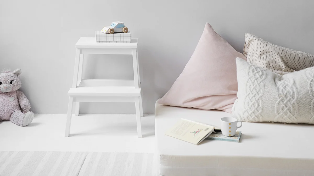
Grounding Earth Tones
Grounding earth tones create a warm and inviting space. Colors like taupe, greige, and light brown can enhance the serene vibe of your yoga area. These neutral choices provide a gentle backdrop, allowing you to add colorful accents without overwhelming the senses. Earthy tones connect you to the natural world, fostering a sense of stability and calm. You can use these colors on your walls or as part of your furniture. They work well with various decor styles, making it easy to create a cohesive look that aligns with your yoga daze paint color.
Consider the Impact of Natural and Artificial Lighting on Color Perception
Daylight vs. Artificial Light
Lighting plays a crucial role in how you perceive color. Natural daylight brings out the true essence of paint colors. It enhances the vibrancy of hues, making calming blues and greens appear more soothing. When you paint your yoga space, consider how much natural light it receives. If your room has large windows, you can enjoy the full effect of your chosen colors throughout the day.
On the other hand, artificial light can alter color perception. Different types of bulbs emit various tones. For example, warm white bulbs can make colors look softer, while cool white bulbs can create a more clinical feel. If you practice yoga in the evening, test how your paint colors look under artificial lighting. You want to ensure that your yoga daze paint color maintains its intended vibe, whether you practice in daylight or at night.
Seasonal Changes in Lighting
Seasons also affect how light enters your space. In winter, shorter days mean less natural light. This change can make colors appear darker or more muted. If you live in an area with significant seasonal shifts, consider how your paint colors will look throughout the year.
In summer, longer days and brighter sunlight can enhance the vibrancy of your colors. You might find that calming blues and greens feel even more refreshing during this time. Pay attention to how the changing seasons impact your yoga environment. You want to create a space that feels inviting and energizing, no matter the time of year.
By understanding the effects of both natural and artificial lighting, you can make informed decisions about your yoga daze paint color. This awareness helps you create a harmonious atmosphere that supports your practice.
Understand Color Undertones and Their Effects
Warm vs. Cool Undertones
When selecting your yoga daze paint color, pay attention to undertones. Colors can have warm or cool undertones, and this distinction affects the overall vibe of your space.
Warm undertones include shades like reds, oranges, and yellows. These colors create a cozy and inviting atmosphere. They can energize your practice, making you feel more alive and motivated. If you want to inspire movement during your sessions, consider using warm undertones.
Cool undertones, on the other hand, consist of blues, greens, and purples. These colors promote calmness and tranquility. They help you focus and relax, making them ideal for meditation or restorative yoga. If you seek a peaceful environment, opt for cool undertones in your paint choices.
How Undertones Affect Overall Vibe
Understanding how undertones influence your space can enhance your yoga experience. For instance, a soft blue with cool undertones can evoke feelings of serenity. You might find that it helps you settle into your practice more easily.
Conversely, a bright orange with warm undertones can uplift your mood. It can create an energetic atmosphere that motivates you to move.
Research shows that colors significantly impact mood. For example, blue light has a calming effect, while warmer colors can increase energy levels. By choosing the right undertones, you can create a space that aligns with your desired emotional state during yoga.
Incorporating these insights into your decision-making process will help you select the perfect yoga daze paint color. Remember, the goal is to create an environment that supports your practice and enhances your overall experience.
Discuss the Significance of Light Reflectance Value (LRV) in Creating the Right Atmosphere
What is LRV?
Light Reflectance Value, or LRV, measures how much visible light a painted surface reflects. This value ranges from 0 to 100, where 0 means no light reflects and 100 means all light reflects. Understanding LRV helps you choose colors that create the right atmosphere for your yoga space.
When you select a color with a high LRV, it reflects more light, making your room feel brighter and more open. This brightness can enhance your yoga practice by creating an uplifting environment. Conversely, colors with a low LRV absorb more light, leading to a cozier, more intimate feel. This can be perfect for creating a calming space for meditation or restorative yoga.
Choosing Colors with Appropriate LRV
For most wall colors, aim for an LRV between 50 and 80. This range keeps your space inviting and balanced. Colors within this range reflect enough light to maintain a bright atmosphere without feeling overwhelming.
If you prefer a more moody vibe, consider colors with a lower LRV. These shades can create a snug and intimate setting, ideal for winding down after a long day. However, be cautious. Too low of an LRV might make your yoga space feel dark and cramped, which could hinder your practice.
Encourage Testing Paint Samples in the Yoga Space
Importance of Sample Testing
Before you commit to a color, test paint samples in your yoga space. This step allows you to see how the colors interact with your environment. Grab a few sample pots of your favorite shades. Apply them to a small section of your wall. This way, you can visualize how each color looks in your unique space.
Consider how the colors resonate with your personal preferences. For instance, if you lean towards calming hues, try soft blues or greens. These colors can create a serene atmosphere perfect for your practice. On the other hand, if you want to energize your space, vibrant yellows or oranges might be the right choice. Testing samples helps you make an informed decision that aligns with your vision for your yoga daze paint color.
Observing Colors at Different Times of Day
Colors can change dramatically depending on the time of day. Observe how your chosen samples look in the morning light, afternoon sun, and evening glow. Natural light can enhance the vibrancy of certain shades. For example, calming blues may appear more soothing in the soft morning light.
In contrast, artificial lighting can alter your perception. A color that feels warm during the day might seem cooler at night. Pay attention to these shifts. You want to ensure that your selected colors maintain their intended vibe throughout the day.
By testing paint samples and observing them at different times, you create a space that feels just right for your yoga practice. This thoughtful approach ensures that your yoga daze paint color enhances your experience, no matter when you practice.
Provide Additional Tips for Visualizing and Trusting Personal Instincts
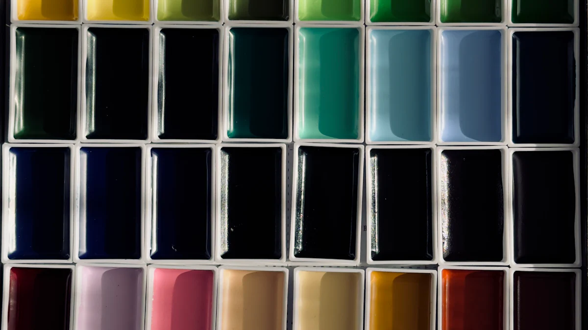
Using Color Swatches
Color swatches can be your best friend when selecting the perfect hue for your yoga space. Grab a few swatches from your local paint store. Hold them up against your walls to see how they look in your environment. This simple step helps you visualize how each color interacts with your space.
Consider the lighting in your room. Natural light can change how colors appear. A swatch that looks calming during the day might feel different at night. So, take your time. Move the swatches around to different spots. This way, you can see how they blend with your furniture and decor.
Don’t hesitate to mix and match. You might find that combining a calming blue with a grounding earth tone creates a balanced atmosphere. Trust your instincts. If a color makes you feel good, it’s likely the right choice for your yoga daze paint color.
Seeking Inspiration from Nature
Nature offers a wealth of inspiration for your yoga space. Look outside. Notice the colors in your garden, the sky, or even the mountains. These natural hues can guide your choices. For instance, soft greens and blues mimic the tranquility of a forest or ocean.
You can also consider the changing seasons. Spring brings fresh pastels, while autumn showcases warm earth tones. Each season has its palette that can enhance your yoga practice.
Take a walk in nature. Observe how different colors affect your mood. Do you feel calm surrounded by greens? Does a sunset inspire warmth and energy? Use these feelings to inform your color choices. By connecting with nature, you create a space that feels alive and vibrant, enhancing your overall yoga experience.
Selecting the right paint colors for your yoga space can transform your practice. Remember to consider your personal preferences and the type of yoga you enjoy. Calming hues like soft blues and greens promote tranquility, while energizing yellows and oranges inspire movement. Testing samples in your space helps you visualize how colors interact with light throughout the day. Trust your instincts and create an environment that resonates with you. Your ideal yoga daze paint color awaits!
FAQ
Does the color of your yoga mat matter?
Absolutely! The color of your yoga mat can influence your practice more than you might think. Color psychology suggests that different hues evoke various emotions and moods. For instance, a calming blue mat can help you feel more relaxed, while a vibrant orange mat might energize your practice. So, choose a color that resonates with your intentions.
What colors are suitable for gentler yoga practices like Yin or Restorative Yoga?
For gentler practices like Yin or Restorative Yoga, softer and calming colors work best. Think about light blues, soft greens, or gentle pastels. These shades promote relaxation and mindfulness, helping you settle into your practice. They create a serene atmosphere that supports your journey inward.
How can colors influence focus and concentration during yoga?
Colors play a significant role in your ability to focus and concentrate. A soothing, neutral-colored mat can help eliminate distractions. This allows you to stay present in each pose. When you surround yourself with calming colors, you create an environment that encourages deeper concentration.
What is the importance of individual preferences in choosing yoga mat colors?
Individual preferences matter a lot when selecting yoga mat colors. While color psychology offers general insights, personal experiences and cultural backgrounds shape how you connect with colors. Choose a mat color that aligns with your unique journey on the mat. Trust your instincts and select what feels right for you.
Can I mix different colors in my yoga space?
Definitely! Mixing colors can create a dynamic and inviting atmosphere. You might combine calming blues with grounding earth tones. This approach adds depth and interest to your space. Just ensure that the colors harmonize well together to maintain a cohesive vibe.
How often should I change the colors in my yoga space?
You don’t have to change colors frequently, but refreshing your space can be beneficial. Consider changing colors seasonally or whenever you feel a shift in your practice. New colors can inspire motivation and rejuvenate your energy. Listen to your intuition and make changes that resonate with you.
Are there any colors to avoid in a yoga space?
While personal preferences vary, it’s wise to avoid overly bright or harsh colors. These can create a chaotic atmosphere and distract from your practice. Instead, focus on softer, more muted tones that promote calmness and serenity. Your yoga space should feel inviting and peaceful.
How can I incorporate color into my yoga accessories?
You can easily incorporate color through accessories like mats, cushions, and wall art. Choose colors that complement your paint choices. For example, if you have calming blue walls, consider a vibrant orange mat for contrast. This balance creates a visually appealing and harmonious space.
Should I consider the size of my yoga space when choosing colors?
Yes, the size of your yoga space matters. Lighter colors can make small spaces feel larger and more open. Darker colors can create a cozy atmosphere but may make a small room feel cramped. Assess your space and choose colors that enhance its dimensions and overall feel.
How can I test colors before committing to them?
Testing colors is crucial! Grab sample pots of your favorite shades and apply them to a small section of your wall. Observe how they look at different times of day. This way, you can see how the colors interact with your space and lighting before making a final decision.
See Also
Navigating Your Way to the Best Yoga Studio
The Key Steps to Selecting Your Ideal Yoga Studio
The Definitive Guide for Finding Your Yoga Studio
Hi my name is Lia and i am your host in this yoga journey in Portugal, Subscribe to our newsletter to receive every week the best of Yoga in Portugal.

We bring back the importance of initiation into womanhood by Roos-Veerle Krijnen & Ella-June Henrard
Welcome to the Women’s Initiation Retreat by Naked Truth Retreats, a transformative journey into the depths of your True Feminine Nature. This retreat invites you to remember the sacredness and wholeness of your being.
Roos-Veerle Krijnen & Ella-June Henrard